Another runner in the night - extra bonus 1 : before and after
To celebrate the 10th page of Another runner in the night here is a little comparison of the pictures before and after transformation.
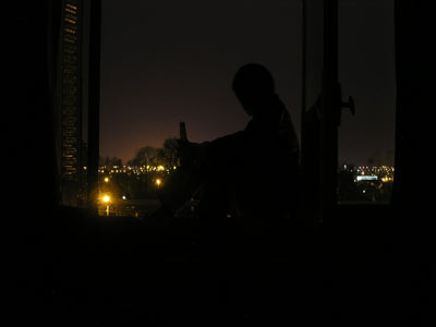
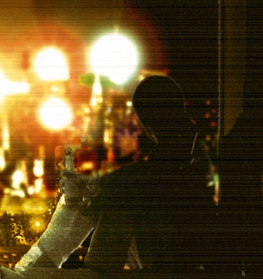
Yeah Troyes (in France) is definitely not a cyberpunk sprawl... The lightning was quite tricky for this one.
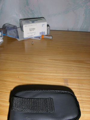
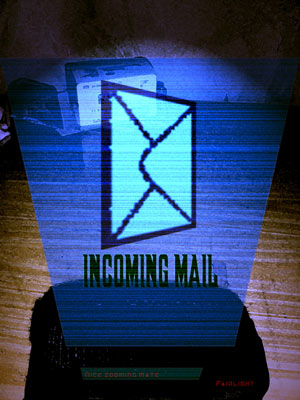
I love this one : just my camera case on my desk... and you get a Fairlight holographic display !
See the box and batteries ? You don’t see them much on the edited picture but believe me, it’s the kind of details that changes everything in a picture.
Notice the text on the holographic display ? You can’t see it in the page. When I edited the fridge pic (the one on page 2), I added a lot of details and text on the fridge screen, but after applying the filters and reducing the image to fit in the page everything was lost... So I decided not to bother and put this kind of text instead... Turned out this one was still more or less visible after reducing the image so I had to blur it out.
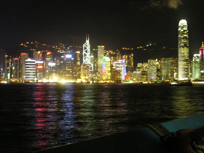
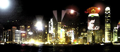
The famous Hong Kong skyline. The original picture was a bit blurry, but that’s not much of a problem because you don’t really see the bluriness after applying the filters. I added a whole building, which is the Xiao Renraku tower. I tried to put it where it is supposed to be and to give it the height it’s supposed to have (though I didn’t know if the stories were higher in 2070 because of trolls). But I didn’t know how large it was. I decided to make it quite large so that it would stand out even next to the 2IFC (which is taller). Also it’s supposed to display pictures, so I guess it has to be large enough. About the displayed picture : I was looking for what to display on a skyscraper in a cyberpunk sprawl... and the answer came quite naturally.
The light in the higher left corner is quite strange : it shouldn’t be there (why would there be such a light in such a place ?) but the whole image felt much better with it.
Maybe I should have added more buildings or more ads, but I didn’t want the picture to feel overcrowded and most ads should be in AR anyway.
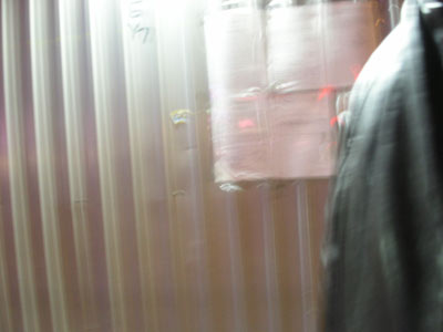
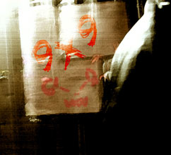
Another example of how a simple, blurry and seemingly useless picture can be turned into something full of atmosphere. The 9x9 is a terrorist group in Shadowrun’s HK.
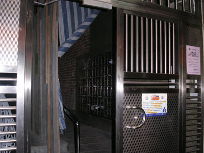
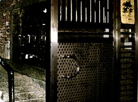
A good thing with Hong-Kong is that it has a lot of places that have a perfect run-down look for the webcomic... And in neighborhood where I can feel safe walking with my camera too. I was a bit clumsy when I edited out the paper on the door, but in the end it gave the feeling that the grid had been punched so I kept it that way.
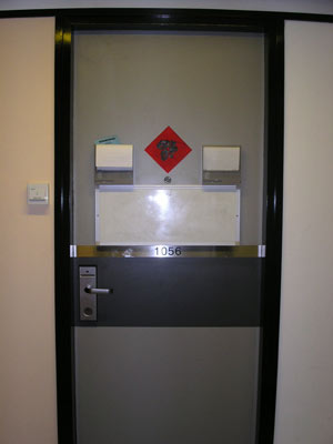
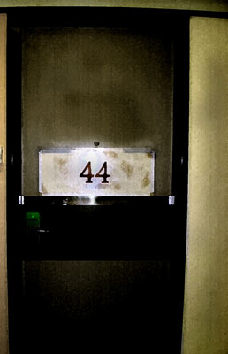
The door of the room directly in front of mine... I like the contrast between the two pictures.
That’s all for today. I hope to make some other articles like this from time to time to explain or point out some things.
Les Shadowforums, version 3.0 (alpha)
La semaine dernière, le forum est tombé dans une embuscade du Vory. Récupéré à temps par le sysop, il s’est retrouvé dans l’atelier du charcudoc, en bien mauvais état.
Heureusement, nous pouvons le renconstruire. Nous avons la technologie pour ça. Nous pouvons en faire un forum, plus fort, plus rapide... en un mot : meilleur.
Et c’est justement ce qui est en train de se faire, petit à petit.
En attendant, le Cyber-Espace continue son business comme d’ordinaire, avec pour cette semaine une nouvelle fournée des drones de Valérian, mais il faut bien avouer que ses réserves prêtes à la publication diminuent de semaines en semaines. Donc si jamais vous voulez donner un coup de main à la relecture ou fournir une aide de jeu, un scénario, une nouvelle ou que sais-je encore, c’est le moment !
WizKids, Inc. has sole ownership of the names, logo, artwork, marks, photographs, sounds, audio, video and/or any proprietary material used in connection with the game Shadowrun. WizKids, Inc. has granted permission to shadowforums to use such names, logos, artwork, marks and/or any proprietary materials for promotional and informational purposes on its website but does not endorse, and is not affiliated with shadowforums in any official capacity whatsoever.